
How to (programmatically) redraw a chart
- Jaco-Ben Vosloo

- Feb 14, 2022
- 4 min read
Updated: Feb 22, 2022
Ever faced a situation where you created a chart in AnyLogic but midway during the simulation you wanted to change a setting of the chart that was not dynamic?
For example in a time plot where you wanted to change the time window (or length of the x-axis) of the plot in order to show more or fewer data. This is typical if you want to show a variable over time but you don't know what the time will be, e.g. the duration of a project, the lifetime of an agent, distance traveled by an agent etc.
Or what about a chart where you wanted to change the maximum Y-axis during run time? If you have multiple charts and you want them to all have the same max Y-axis so that you can easily visually compare the charts.
All of these settings are set up during design time and cannot be changed during the simulation run. Thus you are stuck with whatever choice you made during design time... or are you?
Example
Let's use the following model as an example.
We have a team of 4 IT engineers that need to handle support cases during implementation projects of our new IT platform. The number of support cases for a project can be anything from 1 to 100 cases, with users typically reporting about 1 case per day. We want to measure what is the average number of support cases in the backlog.
The model
A super simple model, right?

The supportCases is an integer variable is set to uniform_discr(1, 100)
The source is set to limit the number of arrivals equal to supportCases
Service block seizes the resourcePool units
The resourcePool contains 4 resources.
The queueLength data set measures the service.queueSize() at the end of each day
The model finishes when the last agent enters the sink block as it contains the following "On Enter" code:
if (self.count() == supportCases) finishSimulation();
The normal plot
Lastly, we need a time plot to show us the queueLength data... but what do we set the time window as?
100? - But what if the model takes longer to complete...
200? - But what if there are only 10 support cases... the chart will then be 95% blank and not that useful...

Let's pick 100 and run the model a few times and have a look at the chart.

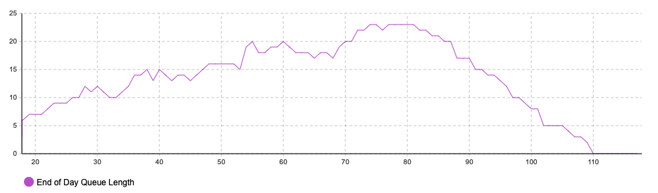

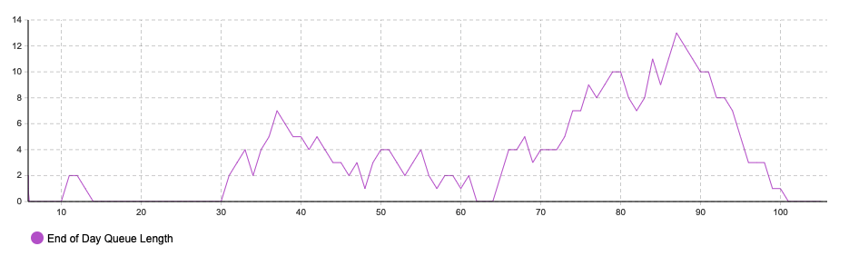

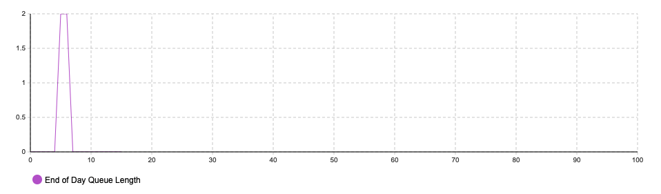

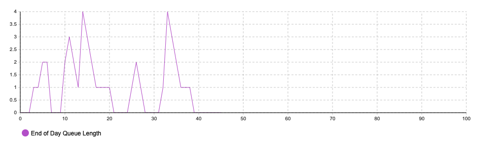

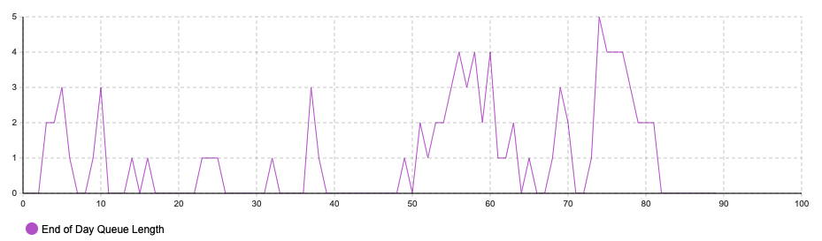
Not bad... but in the first chart the model ended at day 110, so we lost 10 days of initial data which we now can't view on the chart... and in the 3rd chart the model ended before day 10, so the data could be expanded to view it in more detail...
Peeking behind the curtain
The method we will be using to resolve this issue can be used in many other instances in AnyLogic. We will be peeking behind the scenes to have a look at what AnyLogic does for us in the background.
In case you don't already know, while you are building your model, dragging and dropping like a machine, AnyLogic is secretly hard at work creating a Java program in the background.
For you to get a sneak peek at how it is done, you simply need to click on any entry field in the plot and hit Ctrl+j (for Windows) and Cmd+j (on Mac) to view the code behind an object
You will be confronted with a lot of scary code, but you should be able to identify the part that creates the chart for you

Redrawing the plot
Now, all we need to do is copy the code to a function, add one or two things, and then we are in full control of our chart!
Step 1: Create a function - and paste the code you stole from behind the scenes - you might want to format it a bit...
Step 2: Change the argument of the new TimePlot() function where you see the time window input to roundToInt(time()) to ensure that it will always show up to the latest model time.
Step 3: Call the function every time an agent enters the sink
Step 4: Run the model - see how nothing changes
Step 5: Ask a question on Stack Overflow with the AnyLogic tag.
Step 6: Implement the suggestion from Stack Overflow
....
If you went all the way to step 6, your answer on Stack Overflow would probably have been that you need to add the chart you created to the presentation....
So you add presentation.add(plot); to the end of your function
You then run the model and see that you now have as many plots drawn over each other as you have days in the model run...
So you save the plot you create to an external variable and remove it every time before you draw a new one. See the first and last line in the code below.

And there you have it!
Summary
This example might have been very simple, but there are 2 key takeaways here:
You can always peek behind the curtains and see the code AnyLogic generated for you and use it to your advantage (drawing charts with code is just one of the many use cases - follow the blog for more!)
You can overcome any limitation of charts due to static parameters by redrawing them
You can download or play the example model below or view and download the source code in the cloud
What next?
If you liked this post, you are welcome to read more posts by following the links above to similar posts. Remember to subscribe, so that you can get notifications via email or you can also join the mobile app here! Or follow us on any of the social media accounts for future updates. The links are in the Menu bar at the top or the footer at the bottom.
If you want to contact us for some advice, maybe a potential partnership or project or just to say "Hi!", feel free to get in touch here and we will get back to you soon!


Comments